This project aims to redesign the hair salon's website to create a modern, engaging, and highly functional digital presence. The new site will serve as a key tool for attracting new clients and strengthening relationships with existing ones by effectively showcasing the salon's offerings, its updated look, and its commitment to a top-tier customer experience.
UX Designer, User Research
Figma, Adobe XD, Illustrator, Photoshop
This project aims to redesign the hair salon's website to create a modern, engaging, and highly functional digital presence. The new site will serve as a key tool for attracting new clients and strengthening relationships with existing ones by effectively showcasing the salon's offerings, its updated look, and its commitment to a top-tier customer experience.
Showcase Services & Pricing: The new website will feature a clean, intuitive, and easy-to-stand section detailing all hair services, from cuts and color to styling and treatments. A transparent pricing list will be clearly displayed, giving customers the information they need upfront.
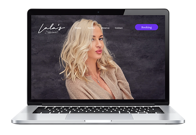
Highlight the New Interior Look: High-quality professional photography will be the centerpiece of the website, giving visitors a virtual tour of the salon's newly redesigned interior. This visual element will communicate the salon's elevated and inviting atmosphere, encouraging potential clients to experience it in person.
Emphasize Excellent Customer Service: The website will build trust and connection through a variety of features. This includes a dedicated team page with photos and bios of the stylists, a testimonials or reviews section, and a blog or news section to share hair care tips and behind-the-scenes content.
Improve User Experience: The new site will be designed for seamless navigation. Key features will include an easy-to-use online booking system, a contact form for inquiries, and a mobile-responsive design to ensure a great experience on any device.
In this project, I took a goal-directed design approach to be quite effective in my design efforts. I found qualitatively research methods to be the most useful, consisting of a kickoff meeting, literature review, competitive analysis, stakeholder interviews, and most important our persona hypothesis construction. I started out by asking myslef some initial key questions.
I had an opportunity to explore real world user feedback by directly engaging with my client’s customers onsite. I compiled all of my findings into affinity diagram and used dot to decide where to focus our efforts. The results confirmed a strong preference for online booking, not just among younger customers but also across other age groups. Additionally, I found that pricing transparency and images of the store very crucial for building trust.
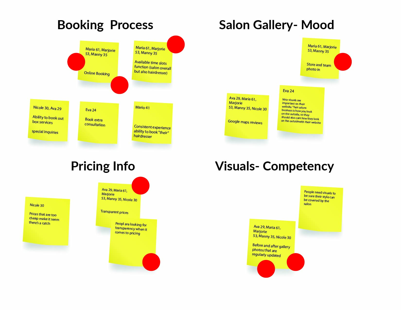
Figure 1.1: Affinity map synthesizing user feedback into four core pillars: Booking Process, Salon Gallery, Pricing Info, and Visual Competency.
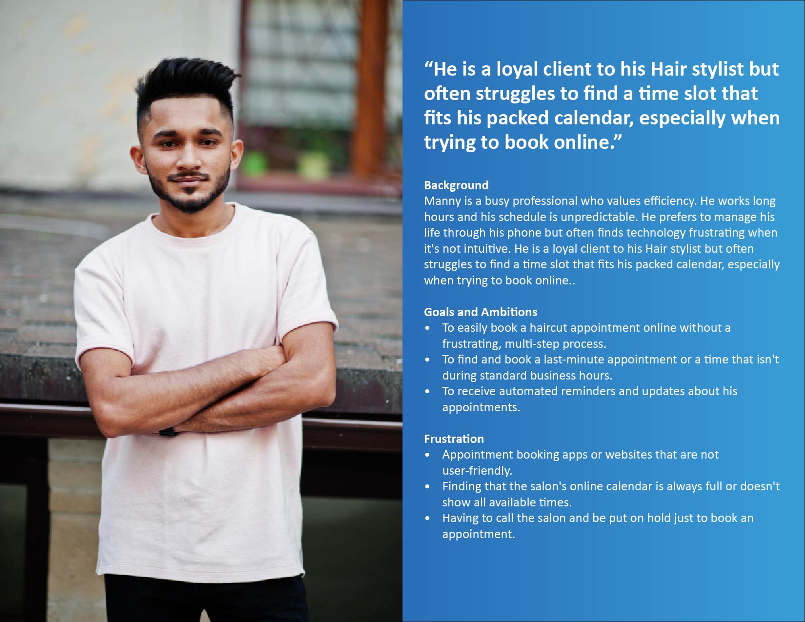
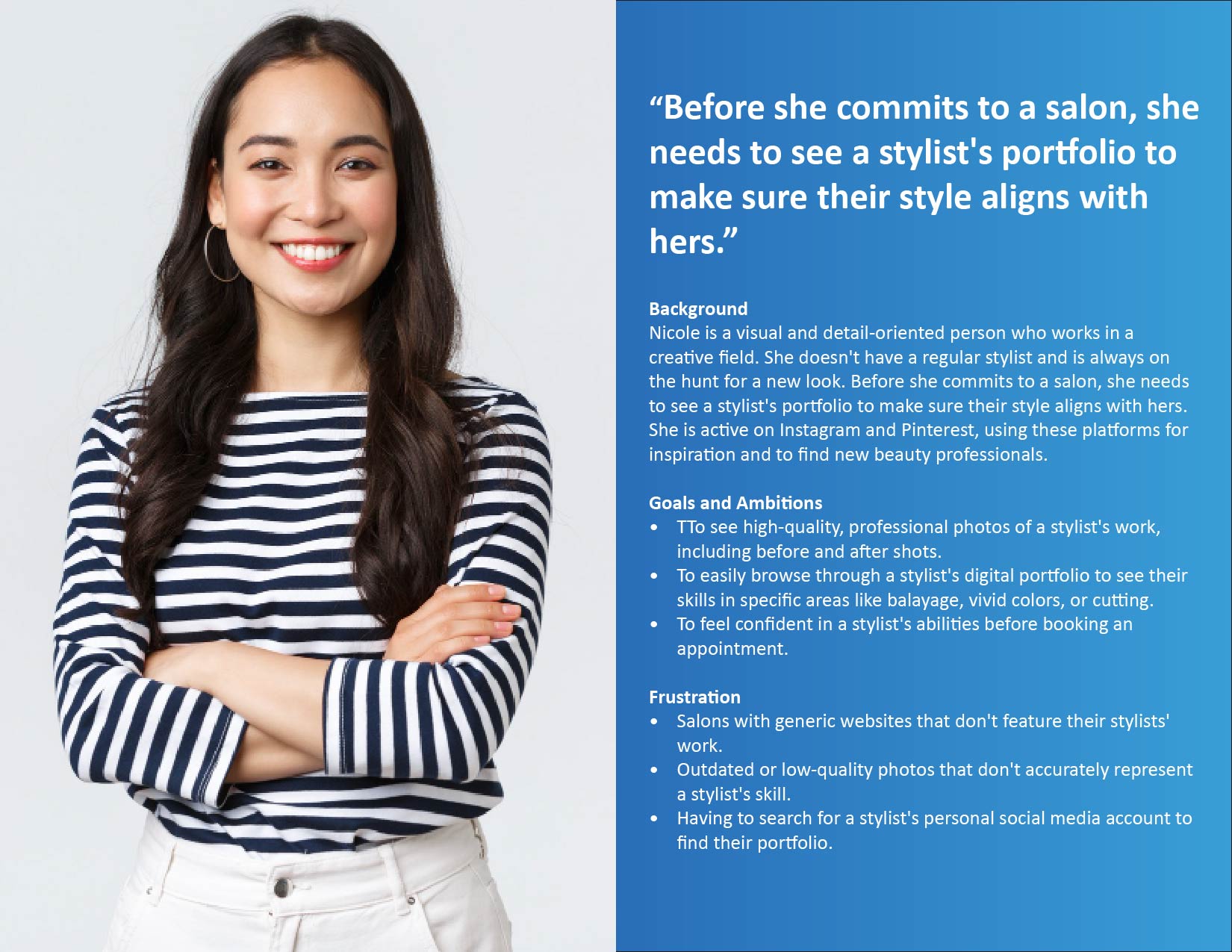
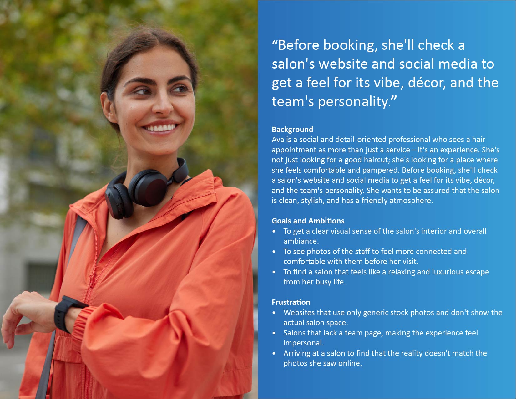
Next I developed a user persona to better unstand our target audience. Creating these persona helps me focus on my design and feature set to meet the specific needs and perfernce of users like them.
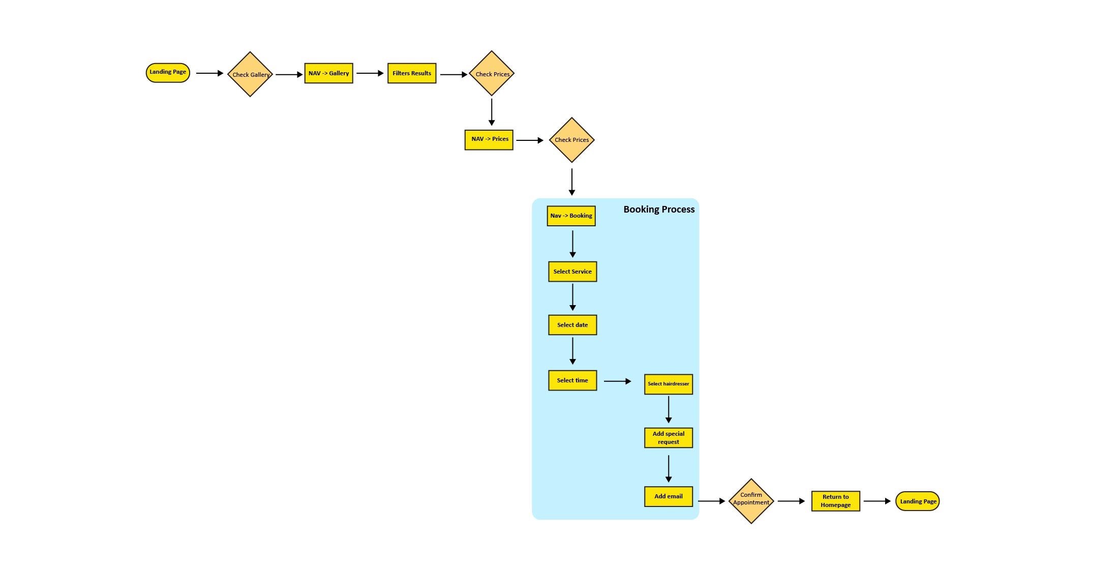
Recognising that user behaviour often involves initially searching for salons on Google Maps and then evaluating the salon’s competence through image galleries on its website — prior to even considering pricing — I refined my primary user flow.
After careful evaluation, we transitioned into the ideation phase. We decided to proceed, despite having a well-defined understanding of the processes that needed to be implemented. My aim was to enhance the personal appeal of our client and her team and encourage user by showcasing a diverse range of salon imagery. Additionally, I thought of introducing a filterable style gallery that would enable users to browse through different hairstyles for different hair types.
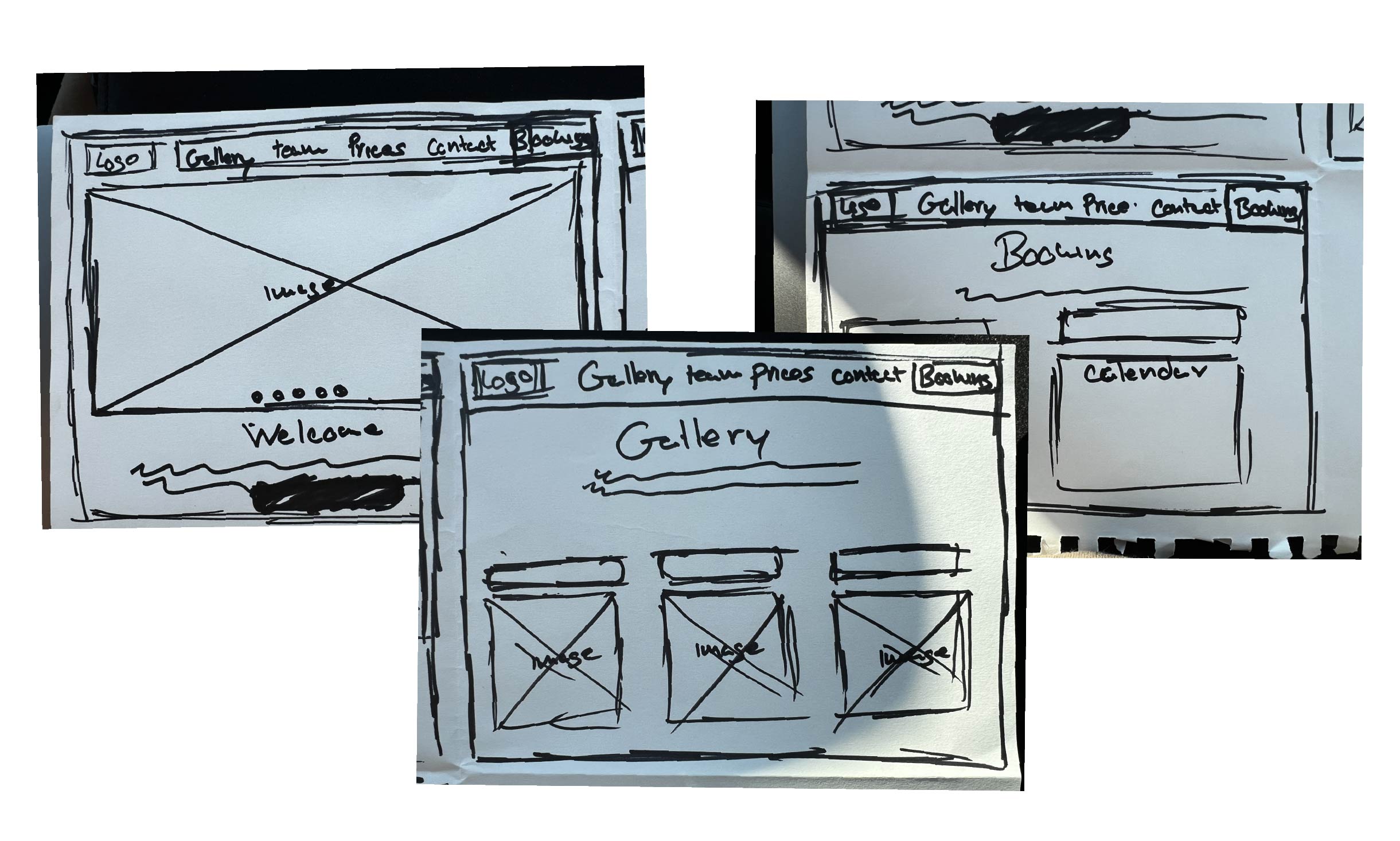
Creating low-fidelity wireframes made rethink the necessity of certain elements and reorganise content for a better user experience. I understood that the before/after style gallery would need to live on a separate page, with a teaser on the main landing page. Because customers like to see before and after pictures, we decided to not limit ourselves to just a carousel on the landing page. It wouldn’t allow the implementation of multiple filters we needed for a pleasant user experience.
During a design critique, I received feedback that prompted me to seek guidance from a UX designer on LinkedIn. I was advised to narrow the project's scope to focus exclusively on the core user journey of booking a hairdresser's appointment, as developing additional user flows or personas was unnecessary. Taking this advice, our team refined the MVP happy path user flow.
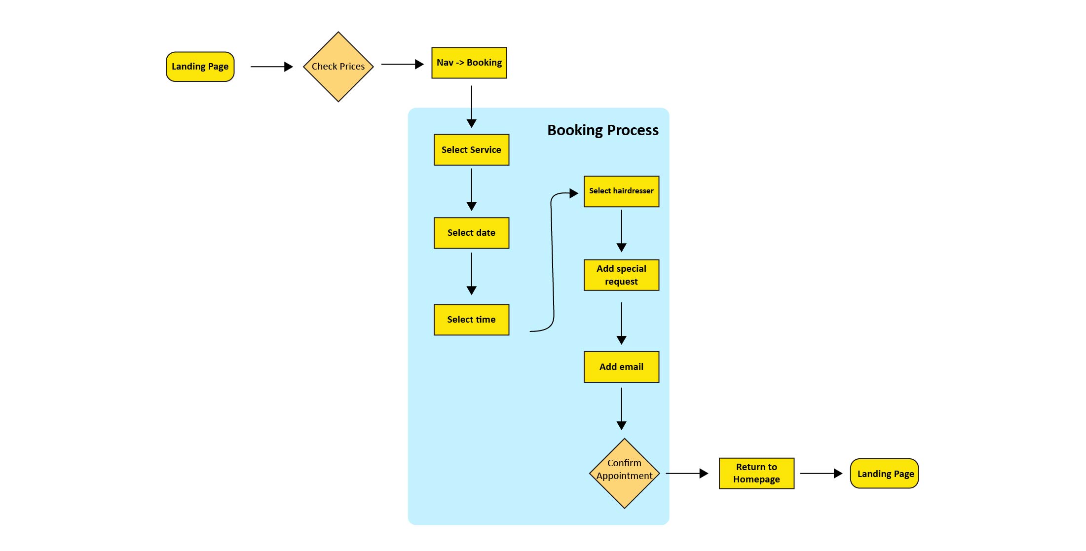
I moved on to crafting my mid-fidelity wireframes. During this phase, I opted for a strategic change in our booking system solution. Rather than merely displaying a static price list on the landing page, we integrated a feature that allows users to select services directly from the price list, guiding them to subsequent booking screens to complete the process.
Diving into hi-fi design was a valuable learning experience. I initially underestimated the importance of small details, but I quickly realized that having many design options doesn't mean you need to use them all. This process reinforced the principle that sometimes, less is more.
When we conducted usability testing with five participants, their real-world feedback was crucial. Observing their interactions revealed a key oversight: we failed to include any markers indicating the service category a user was viewing. Despite this, the overall feedback was positive, and testers found our online booking system easy to use.
“What challenges could we face moving forward?"
“What do our primary user need most?”
"Who do we see as our biggest competitors?"